


April 10, 2014
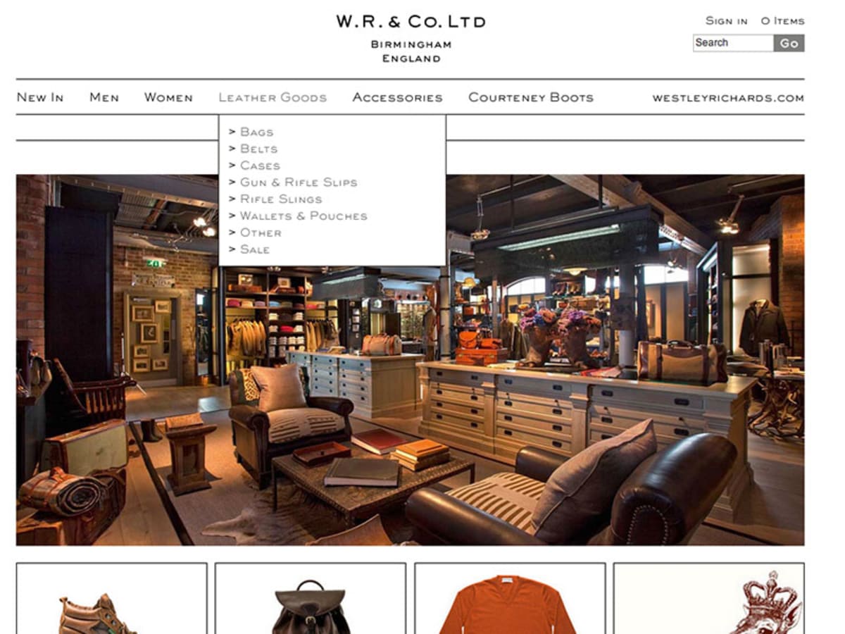
One of our existing clients requested we took their existing ecommerce solution and blog, and made it responsive so it would function correctly on mobiles and tablets. The original Magento ecommerce store had a fixed width, and used compressed contextual imagery which did not translate well to mobiles or any device with a retinadisplay. It is however, very clean so we wanted to make sure the mobile version reflected that, and that the main focus was on the products.
More and more people are accessing the web through a mobile device, and there is data to suggest that mobile web users will surpass desktop web users by 2015. Although our clients Magento store was fully functional though a mobile device, it had flaws. The fixed width ensured the user required to do a lot of horizontal scrolling and the navigation bar featured a drop down menu which was only displayed on hover. As you are probably aware hover events do not work correctly on a mobile device, and trying to use a navigation menu that relies on a hover drop down will be come tiresome to your prospective customers.
Separate Mobile Site or Responsive Website?
There are two ways of optimising e-commerce websites for mobiles in Magento, either by:
- Creating a separate mobile site or..
- Using responsive website design techniques so the website adapts to the screens width.
Separate Mobile Ecommerce Website
In Magento you can create a separate mobile eCommerce website creating a new a new store in the config, with it’s own mobile formatted theme. Then we can detect what device the user is using and redirect them to the correct site.
The advantage of this method is that you can completely remove certain content, or have only certain products available to buy through your mobile store. This ‘barebones’ technique usually provides faster loading speed, which is useful for devices connected over a slower internet connection (3G for example).
The big downside to this method is maintenance. Although your product data remains the same you are essentially having to maintain another store, and often you are duplicating content. More maintenance always results in larger costs. Another negative is that this method doesn’t take into consideration for mobile or tablet devices that are connected over a higher speed internet connection like wifi or 4G.
Responsive Ecommerce Website
Ensuring websites are designed to be identical across all browsers is nowadays seen as bad practice, as the your eCommerce customers can now browse the your store using a variety of different devices, which your store should be catering for. The old school ‘pixel perfect’ design mentality will surely fade way with Internet Explorer 6.
“This solution is much more cost-effective as you are only maintaining the one store, and mobile devices that have a high speed internet connection are not penalised.”
Responsive web design goes some way to fixing this issue by using CSS media queries to display different content depending on the browsers width. This solution is much more cost-effective as you are only maintaining the one store, and it doesn’t check connection speed so mobile devices that have a high speed internet connection are not penalised. CSS media queries are executed by the browser not by javascript, so there is no additional front-end code to download – keeping page load speeds at their optimum.
Optimising the Menu Navigation for Mobile Devices
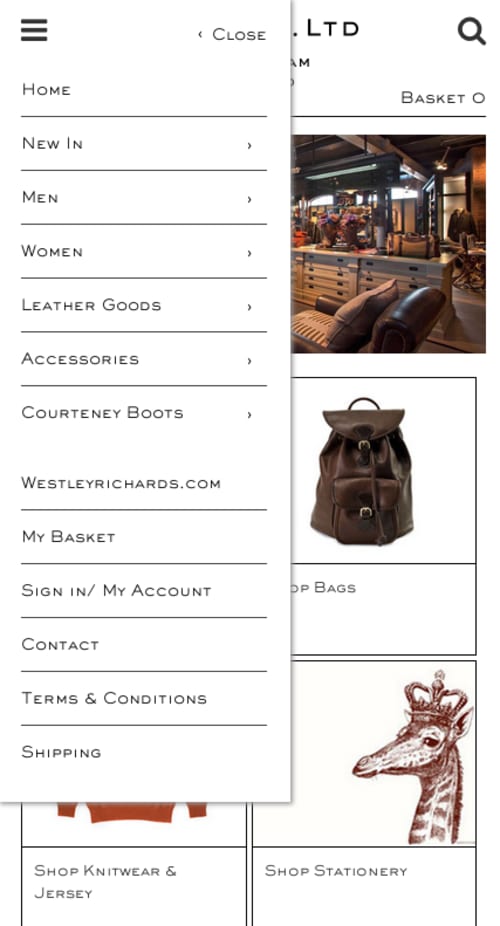
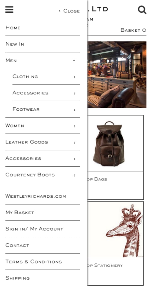
Using responsive website design techniques, we made sure the product images took centre stage on the website and hid the main navigation bar from any mobile devices; the main navigation featured a drop down menu which was pretty much unusable on smaller mobiles. Instead the mobile devices would have a navigation menu placed off screen, and a menu button fixed at the top left of each page.
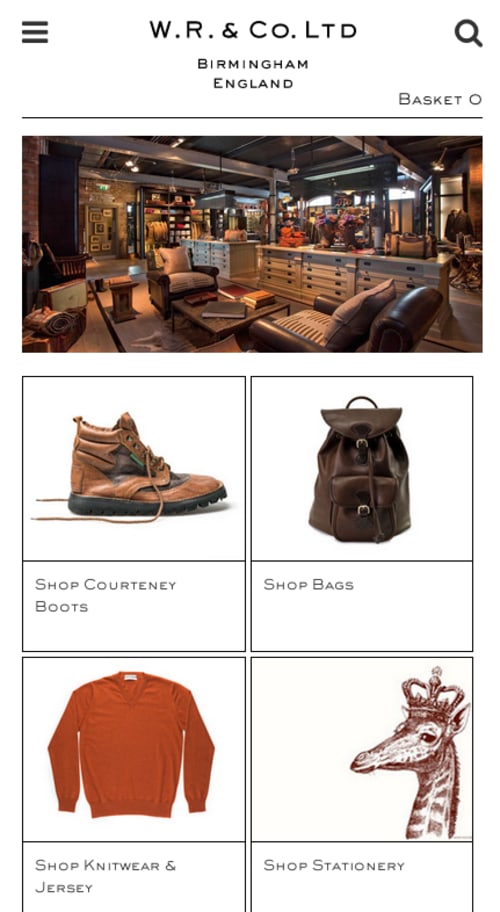
Our clients shop is pretty large, with a lot of products and many categories. Screen real-estate on mobiles is limited so we couldn’t just drop all their categories and subcategories into one large list, this would cause a lot of vertical scrolling. Instead we decided to only display the parent categories, and hide their children in a touch activated dropdown menu.
Prominent Search Bar
The search bar is an important part of any eCommerce website. In a similar way to how we hid the navigation, we also hid the search bar off the top page. The search bar is then activated by clicking on a search icon, which is fixed to the top right of every page.
Using SVG’s Instead of Images
Not only are mobile devices smaller than desktops, almost all of the latest mobile devices and tablets have displays that pack more pixels in per inch. Apple’s marketing term for this is a “Retina display”. Basically this means that images designed for the web at 72dpi will look blurry and pixelated in these high definition displays. The image below shows an example of our client’s web optimised logo looking pretty horrible when scaled on HD displays.
Using a SVG (which is a vector based graphic) means the logo looks beautify crisp on all devices (mobile, tablet and desktop!). SVG’s also are much smaller than your JPEGs or PNGs. So they will load much quicker on a mobile device. Unfortunately SVG’s are not supported in older versions of Internet Explorer, so for the time-being we cannot get rid of them entirely, and we have to create fallback images for any browser that doesn’t support them.
The site also featured icons for various social media providers and other things. We replaced the old bitmap icons with font icons, which are also vectors and scale very nicely.
Responsive Grid Systems Are Great!
The original design used a lot of floated, or absolutely positioned elements, especially in the product pages and the header. We ripped out these elements and put them in a responsive grid, so again the page will adapt to the screen size, and remove horizontal scrolling.
There are many grid systems out there but we used the popular Twitter Bootstrap grid system.
Conclusion
Nowadays we design and develop all our websites from a ‘mobile first’ perspective, but you can usually still breathe life into older designs using these techniques.
Last updated: September 9, 2024