


May 15, 2023
Our guide on what Tooltips are, how to add them easily to your website with just CSS (no javascript required), and usage information that can be important and often overlooked when designing and implementing tooltips.
Introduction
What are tooltips
Tooltips are minor components of a website that provides extra information to the visitor, usually by showing a short amount of contextual text in a small popup. They are usually transient, paired and succinct in function.
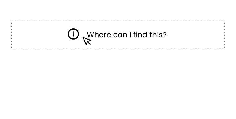
Tooltips are typically activated by hovering or touching a button (Transient) and indicated through an information icon (see image below). However, this doesn’t always work so well on mobile devices and can depend on the device and how the tooltip was added.
We’ll go into Tooltip usability further in the article.
Why are tooltips used?
A tooltip's main functionality is to provide additional information to your visitors, helping them understand elements on your website, such as hints when filling in inputs on a form. The information that is displayed in the tooltip is usually very specific to the area of the page where it was triggered.
How to add tooltips to your website, easily
The CSS-only approach
Adding tooltips to your website can be straightforward. Where possible, a CSS-only solution is great for easy implementation, here's how you would do it. In this guide, we’re going to add a tooltip to a hyperlink. There are a few different ways you can do this, but for simplicity, we’ll do it this way I’ll outline below because it’s easier to follow and get up and running;
The HTML
You’ll need to add the HTML for your hyperlink, which when hovering will show the tooltip. Inside the hyperlink, we’ll add another element which will hold the contents of our tooltip. Let’s see what the HTML for this will look like:
<a href="#" class="tooltip">
Hover me to display the tooltip!
<span class="tooltip-contents">Hello world! I'm the tooltip</span>
</a>
The CSS
Next, we need to add some styles otherwise our tooltip will always be visible, we only want to see it when hovering (in our simple example). The easiest way to get tooltip functionality is to use CSS outlined below:
<style>
.tooltip {
position: relative;
}
.tooltip-contents {
display: none;
}
.tooltip:hover .tooltip-contents {
display: block;
position: absolute;
bottom: 100%;
left: 0;
width: 185px;
background: #222222;
color: #ffffff;
}
</style>
We can see that functionally, it works! But with a few additional lines of CSS we can make it a bit more appealing.
<style>
.tooltip {
position: relative;
}
.tooltip-contents {
display: none;
}
.tooltip:hover .tooltip-contents {
display: block;
position: absolute;
bottom: 100%;
left: 0;
width: 185px;
background: #222222;
color: #ffffff;
/* Better styling */
font-size: 14px;
padding: 4px 8px;
border-radius: 3px;
text-align: center;
}
</style>
... And that's it! One of the most simple ways of adding a tooltip to your website. You can play around with different styling of tooltips like adding directional arrows to them.
The JS approach (advanced)
If you need more customisations in positioning and callbacks, you can use a Javascript library to help you with this, a popular one which is also used by a big frontend framework called Bootstrap, is Popper.
Installation
You can find the installation and usage instructions here: https://popper.js.org/
Demo
And you can play around with it in the browser here: https://codesandbox.io/s/github/floating-ui/popper.js.org/tree/master/examples/placement
Tips to better tooltips
Inclusive tooltips
Adding tooltips to your website that are accessible through different interaction methods is vital in enabling a user-friendly and inclusive browsing experience so that everyone can use them effectively, however, they prefer to interact with your website.
Making tooltips accessible through keyboard navigation can be started by going through a few steps such as; Adding Accessible Rich Internet Applications (ARIA) attributes to your HTML and ensuring that the colour contrast ratio is sufficient for the styling of the tooltip.
Here is a link to a recommended read for Inclusive Tooltips: https://inclusive-components.design/tooltips-toggletips/
Don’t replace always-visible text labels with tooltips!
Many times tooltips are used to replace primary labels that are important and should ideally be always visible for context when browsing a website or filling in forms. Tooltips should not replace primary labels but instead, be used to show additional information that will further assist them in navigating or using that element on the website.
If key information is visible only on hover, then a tooltip is not the place for this information, one: because this important information should be in an always-visible label, and two: because you are not entirely sure whether your user's device will have full hover support.
Touch screens are not second-class!
Tooltips are typically activated by hovering or clicking on an (i) information icon. On mobile, the activating and deactivating of tooltips can be a lacking experience because it will remain open till you can click elsewhere usually, which is not ideal. The best experience using tooltips on many websites is typically desktop because of the intuitive hover to activate and deactivate the tooltip.
It’s important to remember though that if you can, build just as good of an experience for your visitors on mobile, as for many websites their analytics point to mobile visitors being a higher portion than desktop.
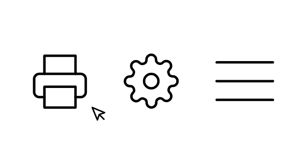
Tooltips for label-less icons
Adding a tooltip for an icon that has no label is a great help to the user.

Additional contextual information only
Tooltips should not hide important information that is necessary for the element related to the tooltip, avoid things like:

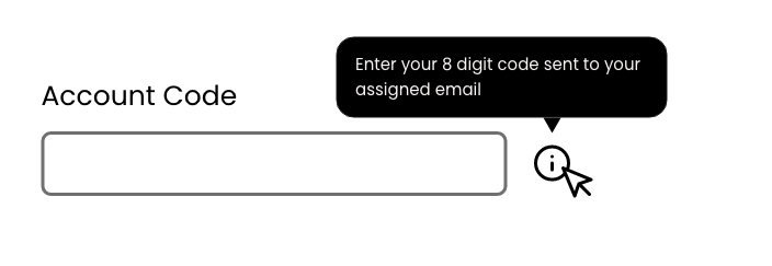
Content type and length
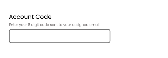
Tooltip content length should be short but concise, helpful and not repetitive, i.e don’t just repeat the input label but in a tooltip, that’s not helpful. Specifying the potential information you should put in this field is helpful.
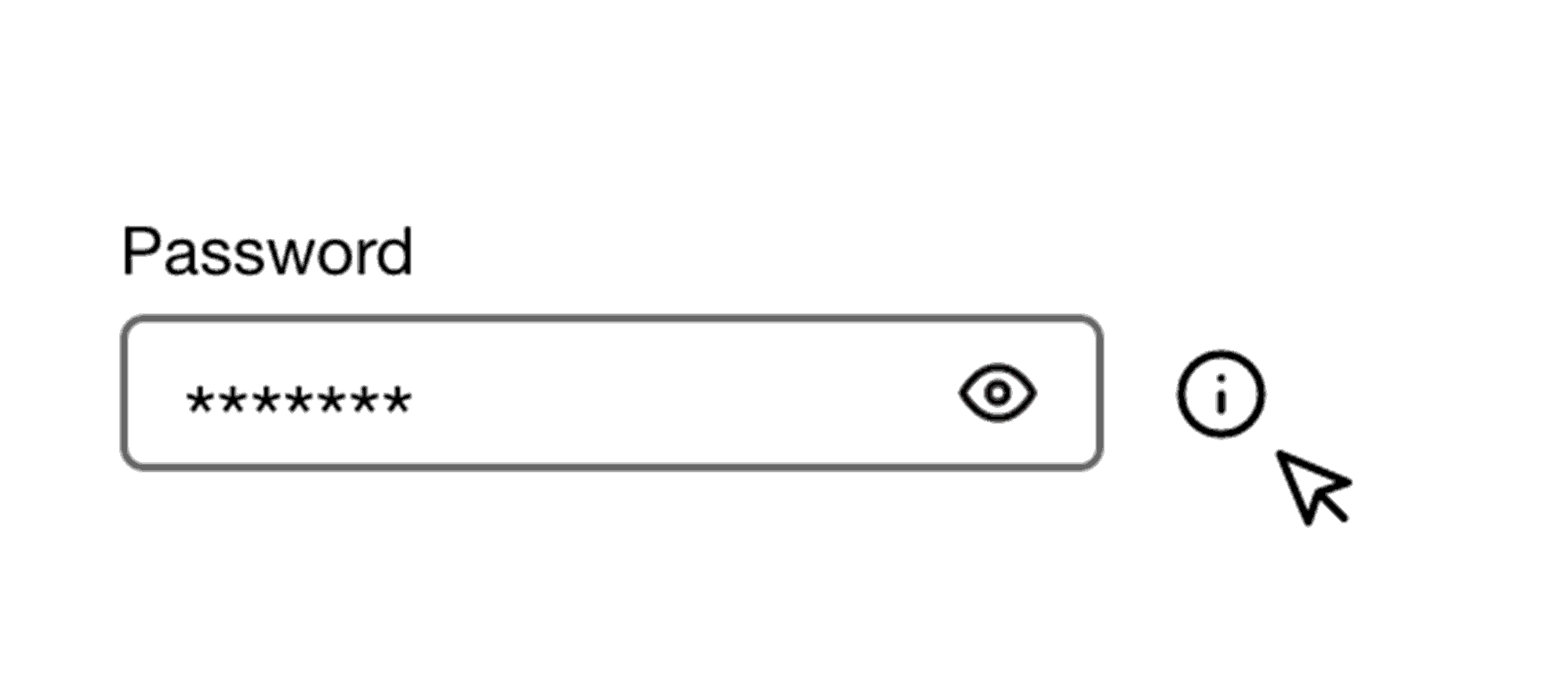
Information Icon
The information icon has been synonymous with displaying a tooltip when interacting with it, it isn’t always the best place to put information though. Consider using help-text or short help-text that opens a tooltip underneath inputs if you can, especially if you end up with tooltips for each input field in a form:


If you'd like to learn more about Tooltips check out M2. Material.io
Last updated: April 15, 2024