September 8, 2023
Before we dive in, we’re going to start with a major caveat…
Serious improvements in your conversion rate won’t come from psychological trickery, but from analysing your customer’s needs, the language that resonates with them, and how they want to interact with your website.
But if you enjoy learning by doing, here’s a few ideas for people who are just getting started and need some inspiration.
1) Calls-to-action
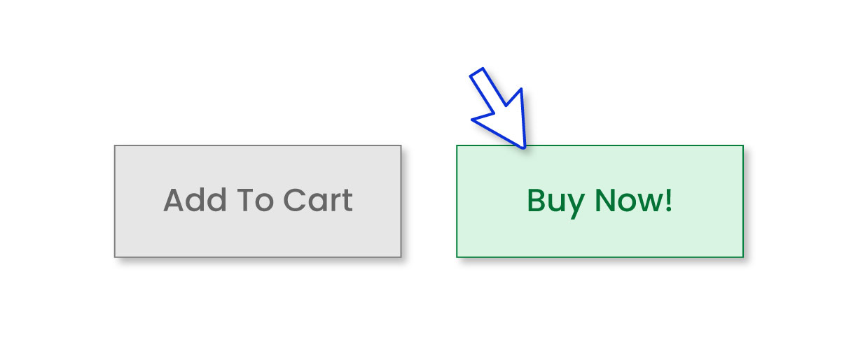
One of the easiest A/B tests you can perform on a website is testing the colours and wording of the calls-to-action. Unless you have a recognisable brand palette (think airbnb), green buttons tend to receive the highest number of clicks due to the association with performing a positive action. But this isn’t always the case. A number of studies have also shown red buttons perform best. So the key here is a button design which complements the rest of the page.
Picking the correct wording for your calls-to-action is likely to be even more impactful than the colour of your buttons. We’ve often found that “Buy Now” performs better than “Add to Basket”. But if you work for an events business, you could also try “Buy Tickets”. If you need inspiration, HubSpot’s 48 Call-to-Action Examples You Can't Help But Click is a good starting point.
2) Social Proof
Social proof is a term that was coined by American psychologist Robert Cialdini and is the concept that people copy the actions of others in situations where they are unsure how to act.
In marketing, social proof covers a similar idea that people look for reviews, recommendations and other trust signals before they purchase a product or service.
For example:
- Does your service have lots of glowing reviews?
- Do you have an accreditation from Which or Good Housekeeping?
- Is your product likely to sell out soon?
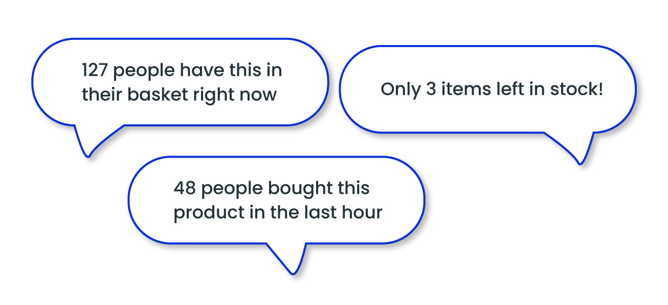
If so, you should experiment with making these things more obvious to customers. That could mean placing a reviews widget right next to the buy button, or showing the number of people who currently have your product in their basket. If the latter sounds tricky to implement, there are tools available which can help speed up the process. One of our favourites is Proof, which has various widgets for building credibility, creating scarcity and boosting customer confidence.
3) Forms
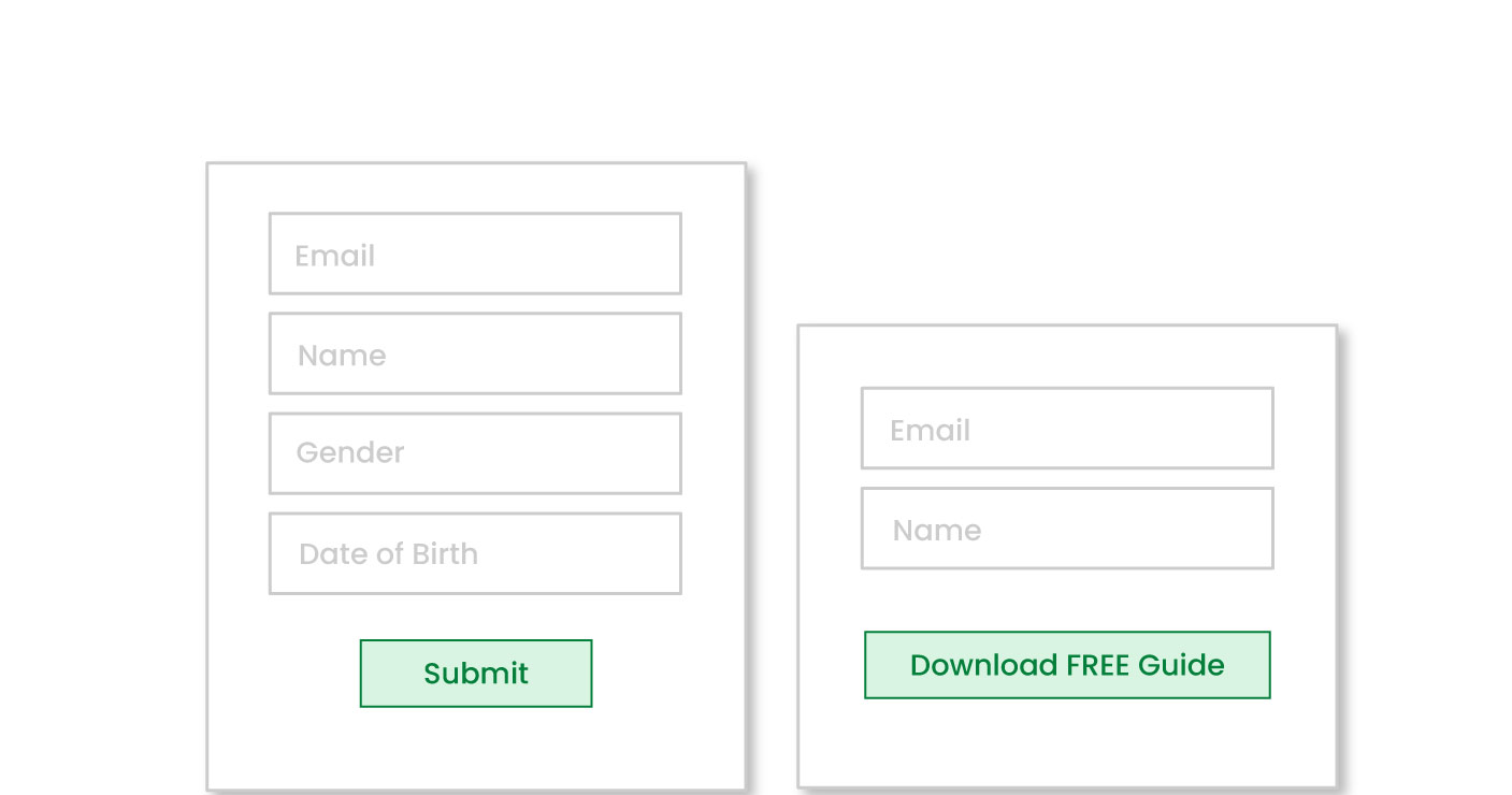
Do you really need to know the customer’s date of birth or their gender before they've made their first purchase? It’s important to identify how every piece of data you collect about a customer is going to be used. Not only is this good for their privacy, it also means you can ditch unnecessary form fields and streamline your checkout or signup process.
And continuing the theme from tip 1, a study of 40,000 websites found that buttons labelled “Submit” had lower conversion rates. So it’s important to get your CTA correct here too.
4) Site Speed
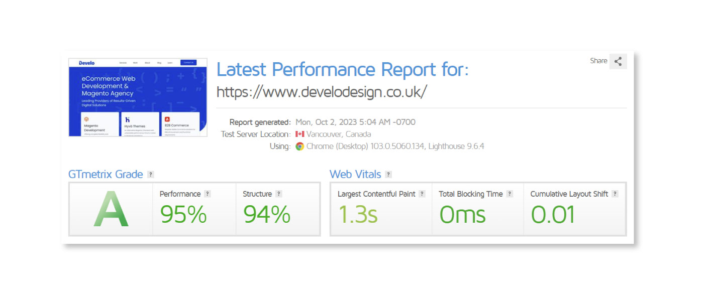
Research has consistently shown that fast page speed will result in a better conversion rate.
So how do you find out how fast your website loads? One of our favourite tools is GTmetrix. This tool grades your website and gives you a hit list of improvements that are required.
A competent web developer will be able to quickly identify what needs to be done to fix “avoid enormous network payloads” and all the other issues highlighted above.
Whilst it can be tricky to quantify the impact of improving the speed of your own website, Walmart found that for every 1 second improvement in their page load time, conversions increased by 2%.
5) Proposition & Messaging
Our final tip is the most important one.
What problem does your product or service solve? And why would a customer buy from you?
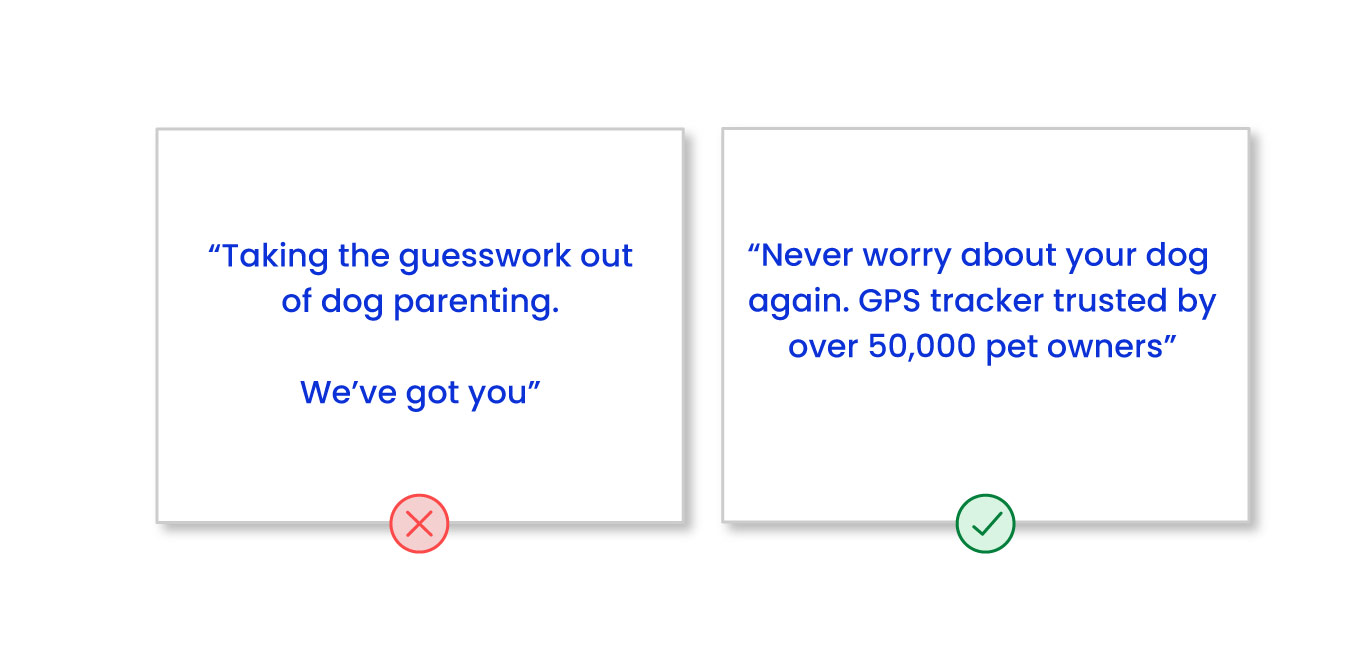
All too often, we see messaging that is vague and fluffy. Take this example, for instance:
“Taking the guesswork out of dog parenting. We got you”
This messaging is from a website that sells GPS trackers for dogs. A valuable tool for an owner who’s terrified of losing their beloved pet. But not only has the website failed to describe the problem their product solves, they’ve also neglected to tell us why we should buy from them.
Alternative messaging, which is likely to be much more impactful, might look like this:
“Never worry about your dog again. GPS tracker trusted by over 50,000 pet owners”
This statement plays on the owner’s fear, whilst also leveraging the social proof we mentioned in tip 2.
Is this the optimal messaging for converting visitors into customers? Probably not. But it’s important to critically examine your proposition and then test, test and test again until you’re confident your messaging hits the mark.
Continue learning
The 3 step process to build an A/B test
Last updated: March 10, 2025


